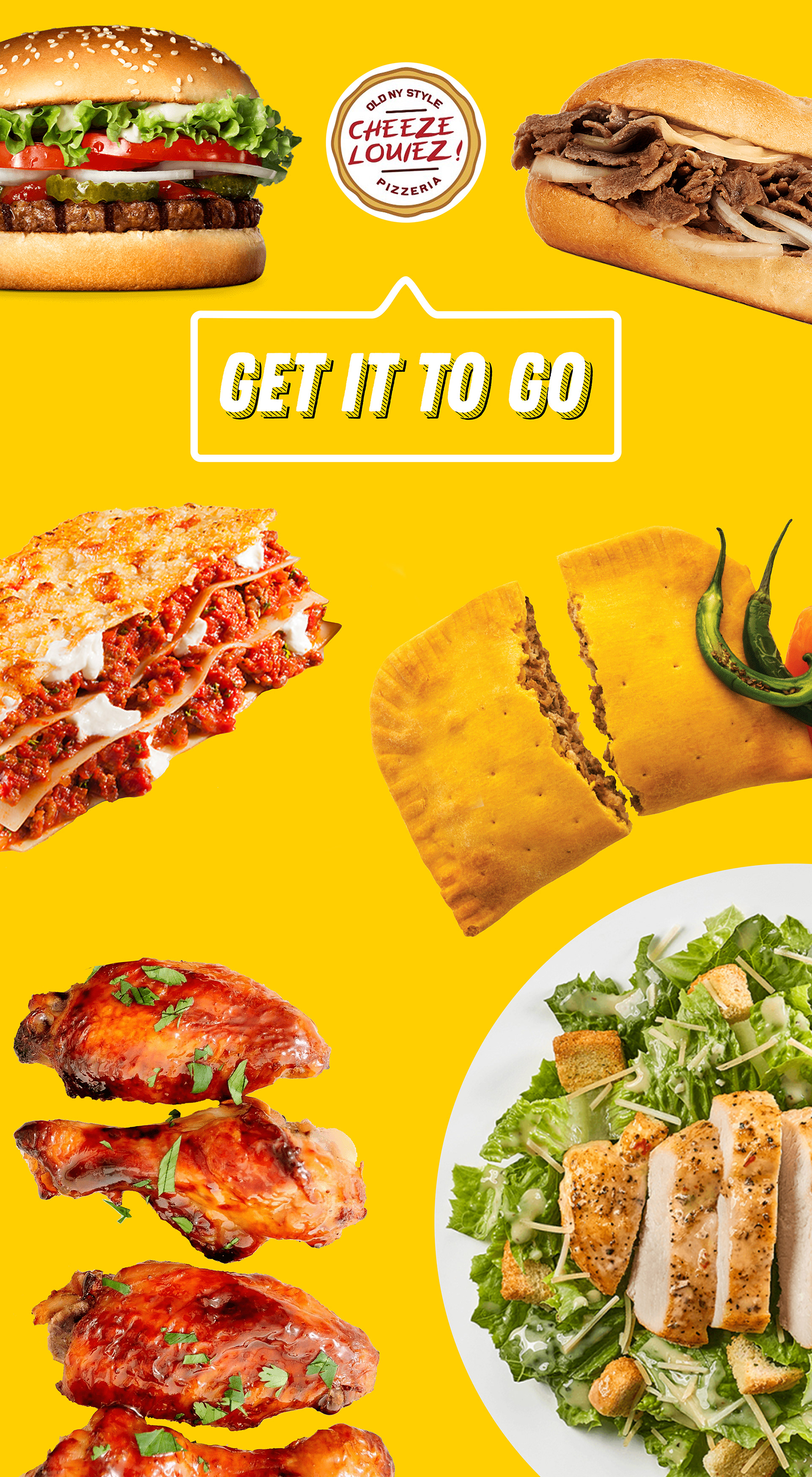
In 2020, I created print advertisement for Cheeze Louiez Pizzeria in Williamsburg Brooklyn. The owner wanted three posters that were eye catching from the road side and also wished for more menu items to be showcased.
Purpose: I had to give purpose to each poster by categorizing the menu by hot, cold, and to-go, I created just that. Visually the purpose was legible even if I didn't have any text to support the imagery. This was my base. The type and color were supporting elements.
Type: The pizzeria wanted to get a message across, which is where the font delivery conceptually came from. The type was placed strategically in a message bubble coming from the logo as though they were saying the message themselves.
Color: Three posters calls for the bright happy trio; the primary colors (RBY). Primary colors attract the eyes far more than any other combo. I just couldn't see a better combo for this client. This client is a pizzeria so I kept the pizza on the red background because if they decided to let go of the other menu items the red poster would still stand and match their current color palette. Blue is obviously giving us cold vibes so that's where the cold food was placed. Lastly, the yellow holds the meals we are happy to enjoy on our off time.


Image Above: Posters in their location.
VIEW MORE WORK...
